Logotype Development 3
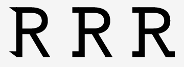
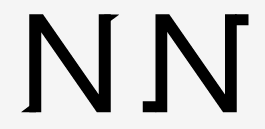
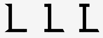
Refining the letterforms so that each one has individual character but work all together as a the logotype.
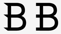 Taking the edge of the sharpe extensions turning them into slab serifs. This gives each letter a more authority, being able to work on there own and in words.

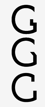 The letter G is important both in the logotype and the alphabet as it is often a letter that has quite a bit of character. I wanted to create something that had character but didn't shout about it. The G in this case is almost and anchor, in the middle of Bryony's surname it had to be neutral in a way but still draw attention to it and the letters around it.
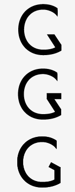
Original G, developing on, increasing the throat size so that the letter is more asymmetrical

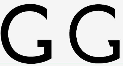
Getting there, still need to sort out the kerning and make sure that all the letters have the right proportions.


No comments:
Post a Comment