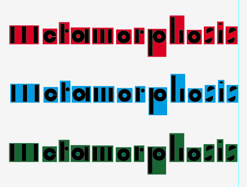
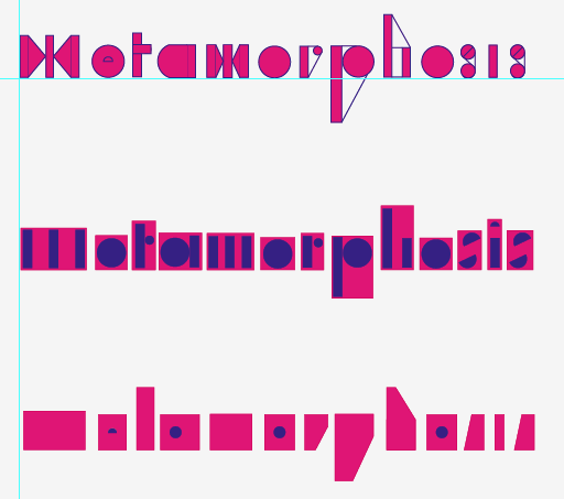
Examples of potential colour palettes.
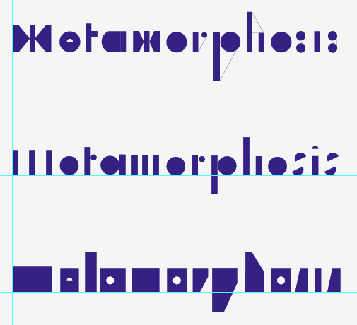
More striking is the purple on green. The colours had to work with each other and work well on a dark background which is what stock they will be printed onto.
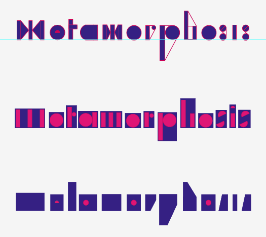
An example of the preferred colour palette.
meta postives1 Alteration print colour ways, wanting to keep the amount of colours down in order for the prints to be time and cost effective, more colours = more time and money. As I am printed a large amount of colour on the design I don't want to print a large amount of colours which could cause the paper to warp.
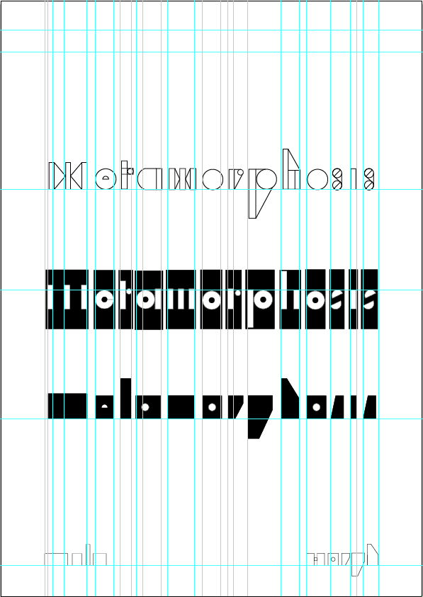
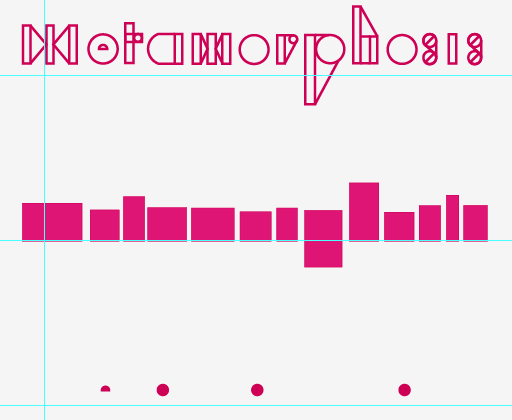
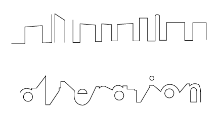
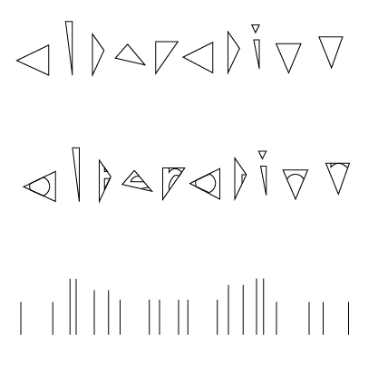
Alteration 1 From some of the other type experiments using the negative space in-between each letter I wanted to add to the set of prints with some small editions which would fit in with the set and be applicable at the book fair, so I included some designs for bookmarks.
Positive Bcards

No comments:
Post a Comment