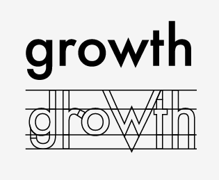
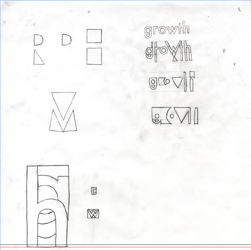
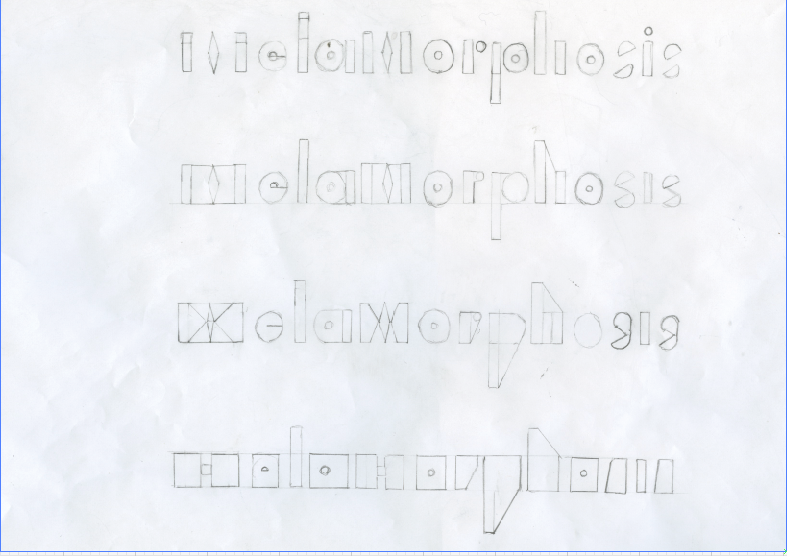
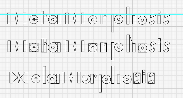
So I went back to using pen and paper / illustrator and started to manipulate various words using different techniques by adding and subtracting various elements from the letterforms of various words associated with metamorphosis; growth and alteration were among these words.
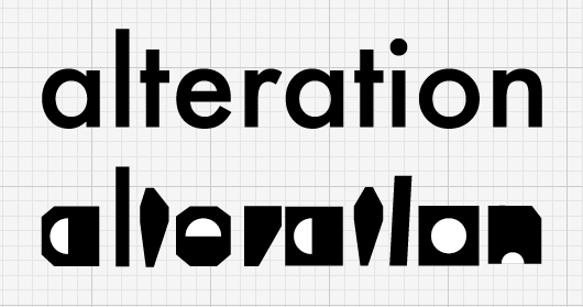
Starting with the word alteration in Futura and taking the elements such as the bowls and loops from the letter forms and placing emphasis on there geometric forms while creating more rigid shapes for the whole letter.
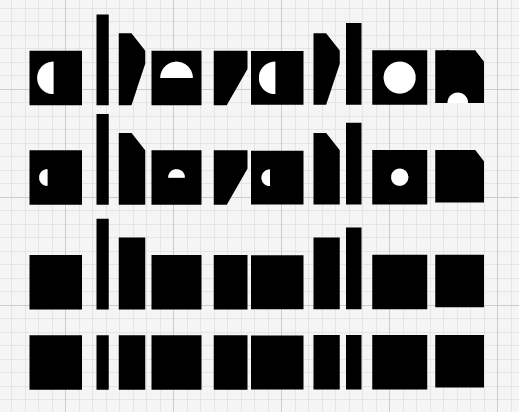
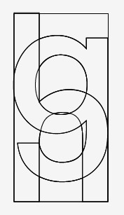
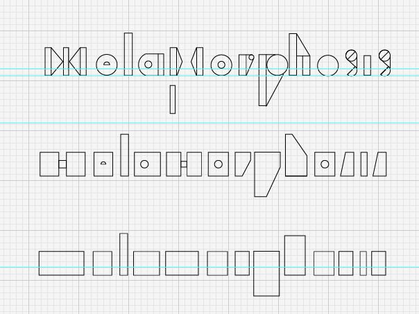
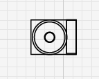
Some example using increasing the size of the shapes so that each shape merges into one another. Overlaying 2 letters one on top of the other and selecting different sections from the image to create the different outcomes.
Finding different ways to change the letter forms using primarily the same process as before splitting the breaking the letterforms into shapes.
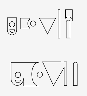
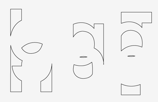
Vectorising some of the scans.
Using a similar approach showing the progress of change over a series of stages.
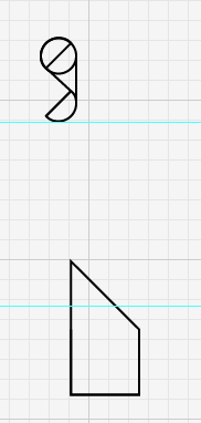
Some of the interesting shapes that came from experimenting.
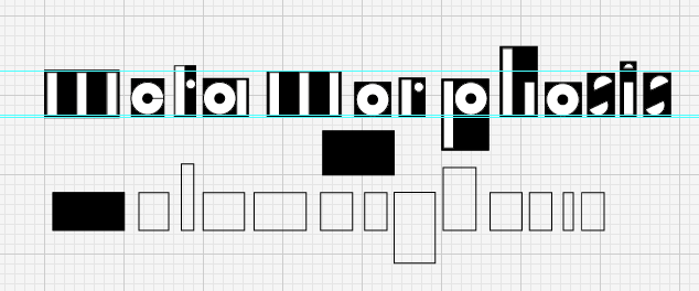
Overlaying the letters created on the negative shapes created from reducing the original letters.
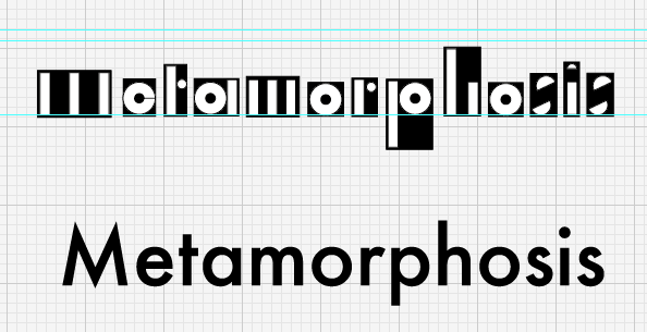
More of an even distribution of the shapes behind the letters, making the letterforms more legible but keeping elements of abstractness.


No comments:
Post a Comment